
The words and the illustrations are only two parts of the process. The whole beautiful finished product could not have been completed without the team at Penguin bringing all the elements together and binding them into the final book.
Scope
When Matt’s illustrations started to come through, still more changes needed to be made to the text. Our wonderful editor Heather Curdie was able to see that Matts depiction of the world over the wall was so complete, that it allowed me more scope with the text to explore the emotion of the scene, rather than the content. Here I ebbed and flowed again and on the page where Suri first describes what she see’s to Eva, I changed the text to give the feeling of the freedom of the landscape.
“Suri spoke of green meadows and aqua rivers…
Peach blossoms and golden bridges…“
became
“Suri spoke of rivers running through rolling hills…
and golden bridges stretching far beyond site.“
Continuity
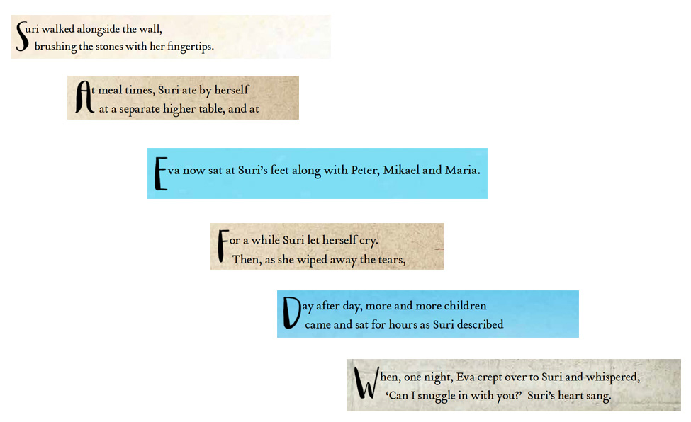
Continuity and cohesion also needed to be maintained. As the author I was so close to the complete story that I couldn’t see where it started to become disjointed to the new reader. Luckily Heather is marvellous at this and with just a few more changes to the text the story became clearer. The line that caused confusion was
“Suri turned from the courtyard and continued her walk. She wanted to mark her height on the wall behind the pond.“
This line didn’t match the illustration as Suri wasn’t behind the pond when she marked her height and the storyline didn’t naturally follow on from the previous page. I rewrote three optional changes, and together Heather and Marina, our highly talented designer, worked the text into the restricted space we had within the illustration. It was replaced with the final words,
“Every month Suri marked her height on the wall. One morning, standing tall against the stones, Suri felt for the wall above her head…but it wasn’t there.“
Detail
One of my favourite things about Suri’s Wall is the font used for the title. Marina Messiha at Penguin took all the individual text and illustrative elements and brought them all together into book form.
But the font isn’t just in the title. It is reused on every page in the first character of the paragraph. This one element of attention to detail draws the look and feel of the book together so seamlessly that I bet you didn’t even notice it until now?
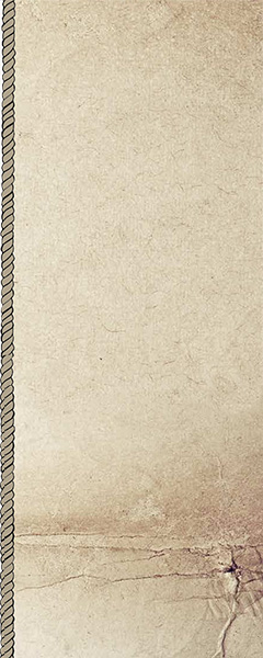
Where should the text sit? In the illustration? Beside it? A lot of the time text can feel slapped on the page, lost or drowned by the content. However Marina came up with a solution that tightened the pages and again brought recurrent visual cues into the book. Parchment and rope to bind it together.
 Cover Design
Here again the Penguin team had another stroke of genius – it has become a habit of theirs. If you are one of the lucky few with a hard cover version of this book, then I hope you had the same delightful surprise that I had when you ran your hand over the cover for the first time. The textured paper, called Wibalin and debossing of the title words embodies Suri’s Wall so completely.
The choice of the cover illustration continues perfectly on the first page of the book. If you flick back and forth between the two, you will see the entire wall from the eastern gate to the western building. 
You must be logged in to post a comment.