
When Matt read Suri’s Wall he immediately started to create the world in which the story was set. It wasn’t enough to just design something that looked nice, he built in logic and cohesion to bind the elements of the story into an environment that could be relatable to anyone, from anywhere and at any time.
Matt came up with the idea of the world being designed with a medieval theme. That suited extremely well as it removed specificity from the time and environment. I had always seen the story in terms of colour rather than specific elements, so it was my very good fortune that Matt was so brilliant at creating all of those details with very little description on my part. I knew that the inside of the wall needed to have different colours to the outside and Matt had the very same idea when he read the story, and so the book started to emerge.
Suri Comes To Life
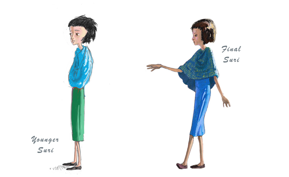
Here are Matt’s initial sketch concepts for Suri. Matt came up with the idea of Suri being wrapped up in the shawl. The wall is Suri’s friend, the shawl is her protection. It fitted beautifully. Matt wanted Suri to look mysterious and perhaps a bit exotic but without being too stereotypically beautiful and he managed it so well.
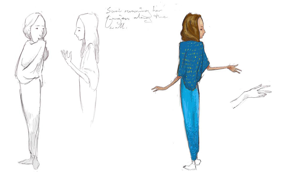
However we thought that Suri was just a little bit too old in this initial sketch. She could be 14 or 15, where as she is more 11 to 13 in the story, before the growth spurt of puberty should have started, so Matt worked his magic and gave her a little more youth.
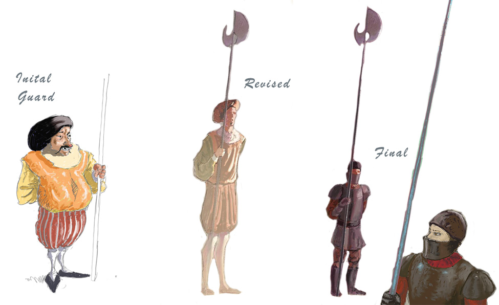
The Guard
The design of the guard was an interesting evolution as well. The initial sketch by Matt didn’t quite hit the mark. I thought he looked too intimidating and I didn’t feel comfortable having him as the guardian of our children. I wanted there to be no question what so ever of his intent, which was to protect the children at all costs. He would fight for them and die to keep them safe. Matt very quickly found the right design.
Always Refining
I changed the text right up until the last moment, and similarly Matt refined his artwork even after finals had been delivered. The most tricky page is the double spread on 28-29 when the guard talks to Suri. There was much debate on how to depict the world over the wall as well as exactly how much to show and even the colours to use. As you’ll see in the image below, Matt’s final artwork differs greatly to his initial sketch.

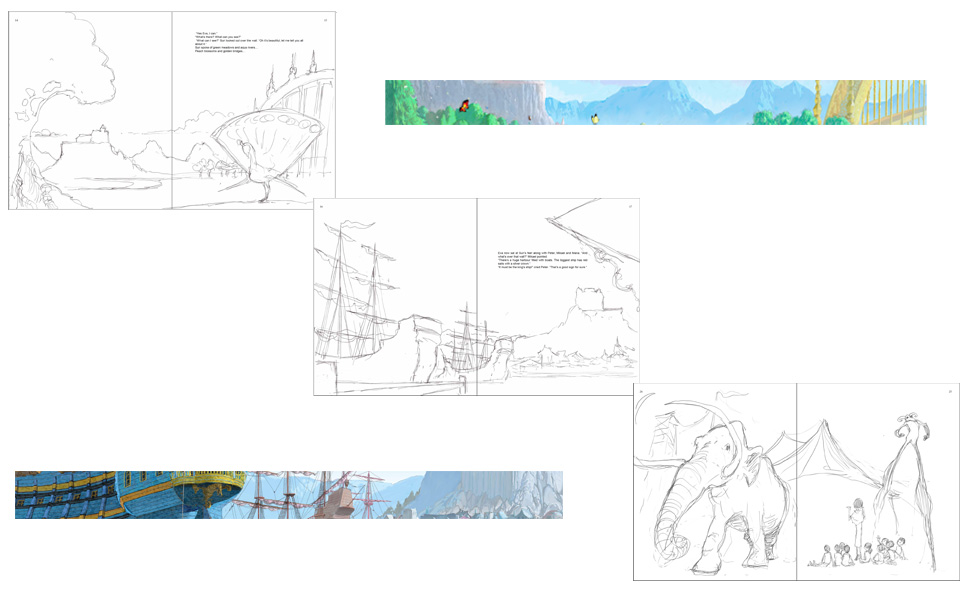
The World Within
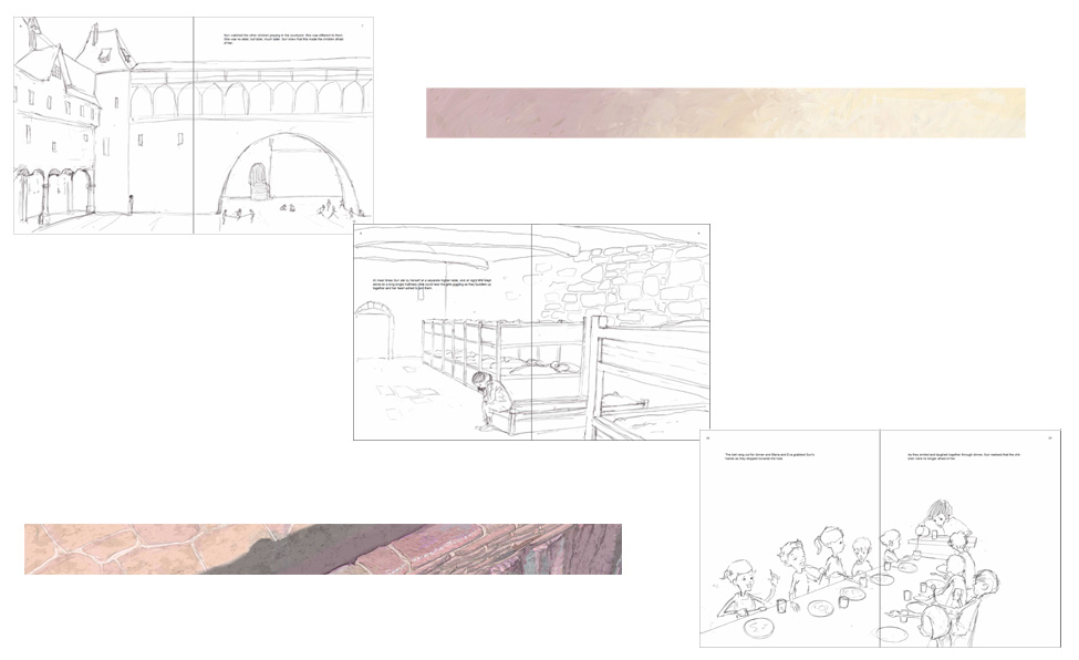
When Matt designed the world of Suri’s Wall he very carefully chose a specific colour palette to help differentiate within the wall, from without. It reflects the emotional well-being of Suri and runs parallel to the emergence of resilience, kindness and hope. See the initial sketches of the world within the wall and the snippets of final colour that are used. They remain consistent throughout the book, until the final crucial page.
The World Without
When Suri describes the world that she can see over the wall, this is what I describe as The Wizard of Oz moment. Do you remember when Dorothy opened the door and stepped into Munchkinland? I do. I remember it so clearly. I watched that movie almost weekly as a young child and it holds very special memories for me. I am thrilled beyond words that Matt was able to recreate that very same feeling of overwhelming wonder in these illustrations. See the sketches and snippets of final colour that are used.
You must be logged in to post a comment.